
Assignment
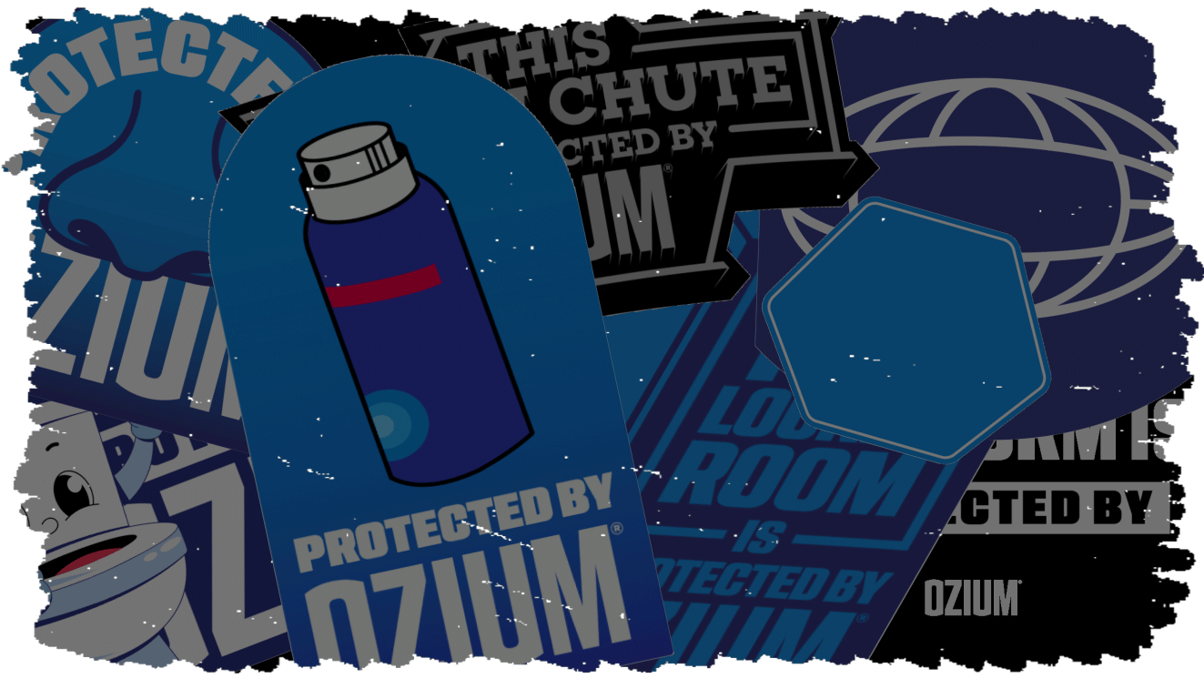
After nearly 50 years as a leader in snack manufacturing and distribution, Truly Good Foods was ready to cook up a fresh, endorsed brand. But, before they could earn shelf space, they needed branding as craveable as their snack bars. We baked them a new visual identity system using our own recipe, Golden Hour.
What came out of that?
Food metaphors aside, Truly Good Foods came to us with a product, an audience, and a mantra: snack time should be everybody’s favorite time of the day.
Our team had the endless creative freedom to create Golden Hour's name, packaging design, and personality all from scratch.
Photographer: Paul Skinner
Graphic Designers: Nima Ayagh, Ximena Alvarado
UX/UI Designers: Mack Fuhrman, Emily Hinshaw
Copywriter: Duncan Heredia
Associate Creative Director: Christopher Bazata
Creative Director: Chad Brophy
Project Managers: Becky Radford, Kelsey Lynch
Account Executive: Heather Opie
Agency: Tattoo Projects
Graphic Designers: Nima Ayagh, Ximena Alvarado
UX/UI Designers: Mack Fuhrman, Emily Hinshaw
Copywriter: Duncan Heredia
Associate Creative Director: Christopher Bazata
Creative Director: Chad Brophy
Project Managers: Becky Radford, Kelsey Lynch
Account Executive: Heather Opie
Agency: Tattoo Projects
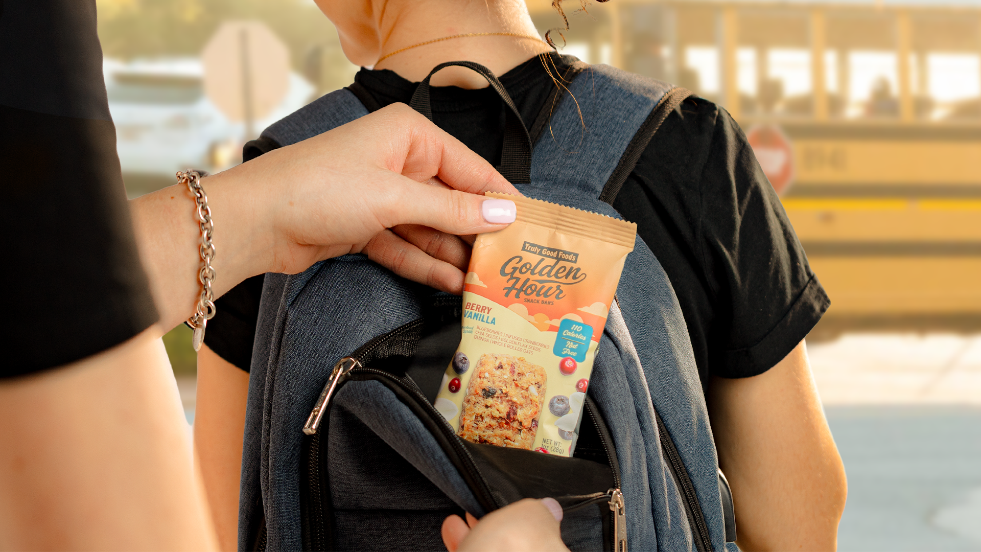
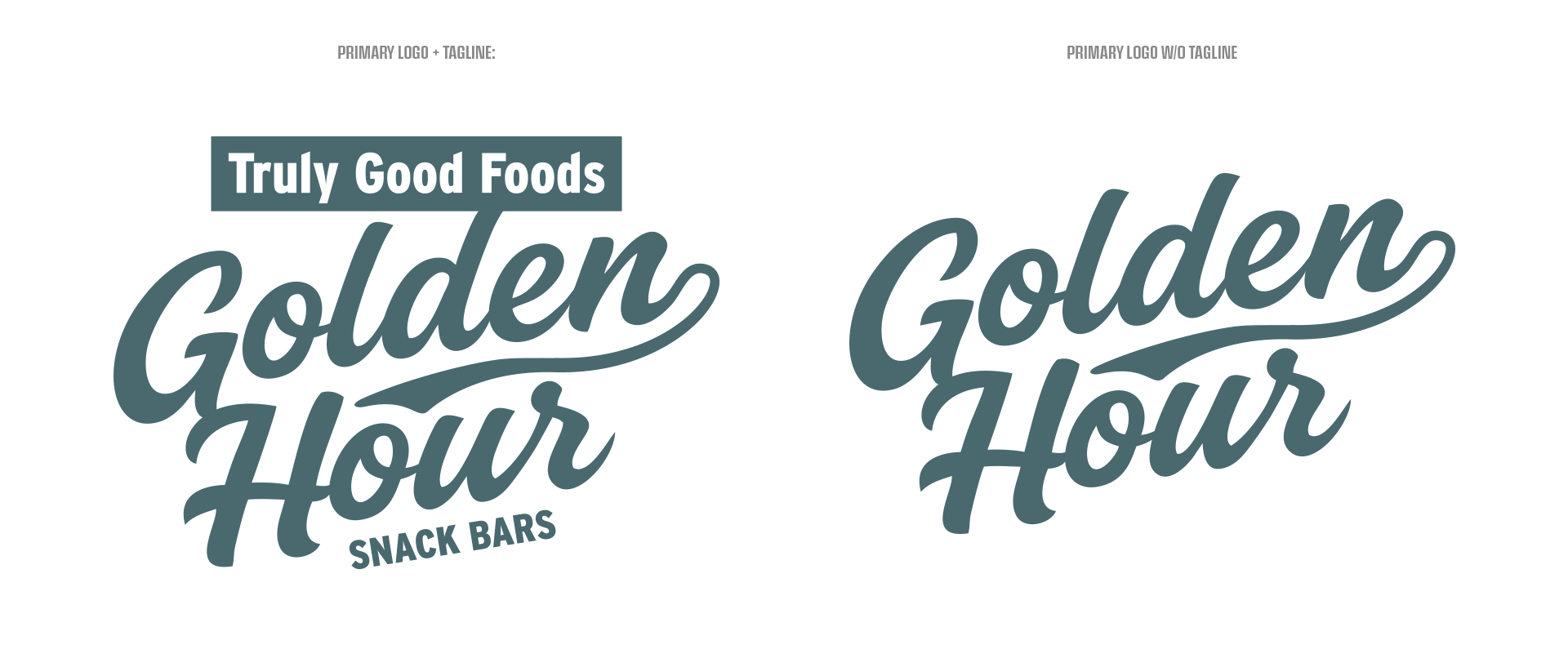

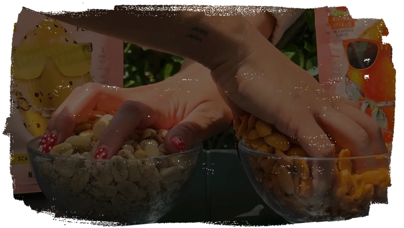
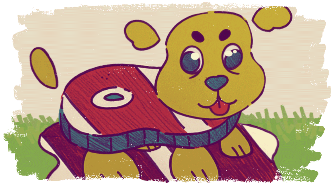
A recipe for brand awareness.
The name is rooted in nostalgia, while reminding consumers that snack time isn’t meant to be rushed. It’s a time to be savored.
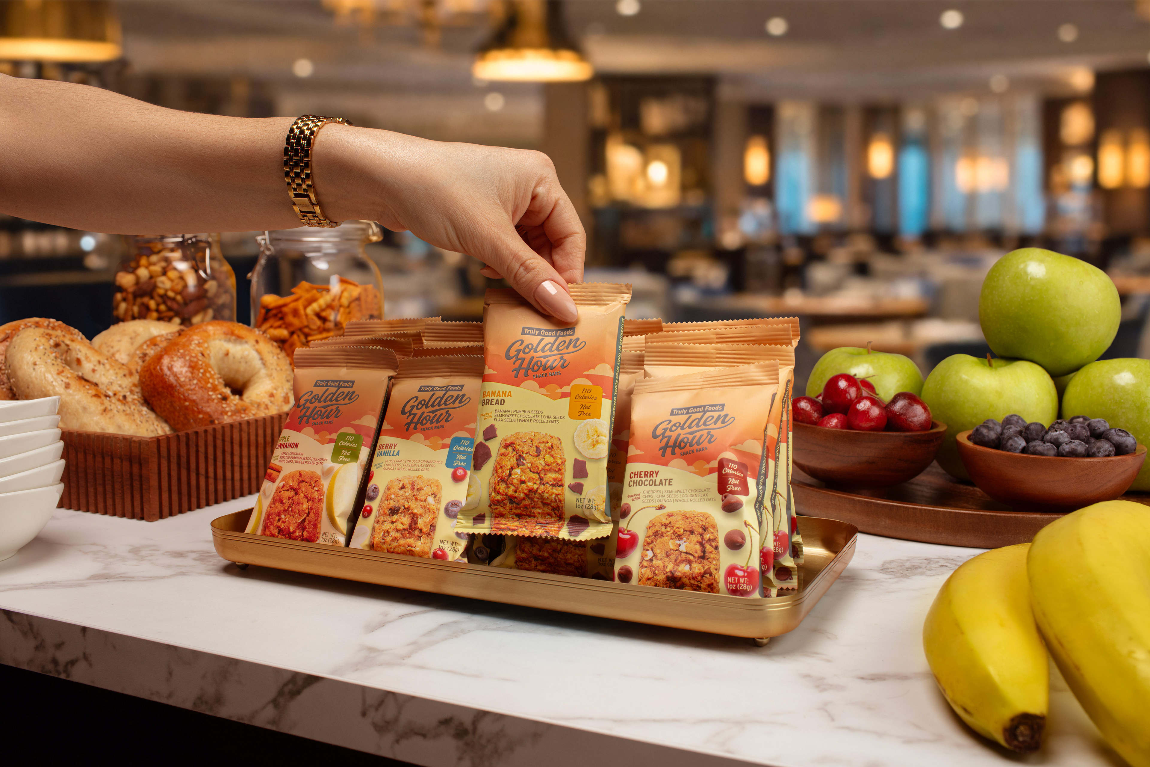
The packaging used 2D illustrations and a sign-painter brush font to evoke the familiar comfort of the product name, with flavor notes as accents to differentiate each SKU.
The name is rooted in nostalgia, while reminding consumers that snack time isn’t meant to be rushed. It’s a time to be savored.
The packaging used 2D illustrations and a sign-painter brush font to evoke the familiar comfort of the product name, with flavor notes as accents to differentiate each SKU.
Okay there's more to this.
I swear I'm gonna finish this page— I just got roped into some work-related thing. STAY TUNED!
I swear I'm gonna finish this page— I just got roped into some work-related thing. STAY TUNED!